
Iced drinks brand KUPO receives fresh look from Slice Design
Iced coffee and tea brand KUPO has unveiled a new brand identity and packaging design created by Slice Design, developed
Iced coffee and tea brand KUPO has unveiled a new brand identity and packaging design created by Slice Design, developed

Searious Business and Ecourage have contributed to a reuse and refill project for the professional cleaning sector – reporting an 84%
Dr. Bronner’s has adopted Atlantic Packaging’s Fishbone Dog Bone – a fibre-based, kerbside recyclable alternative to plastic multipack

Iced coffee and tea brand KUPO has unveiled a new brand identity and packaging design created by Slice Design, developed for international markets including the UK and Gulf Cooperation Council (GCC) region.
KUPO is inspired by South Korea’s ‘pour-over-ice’ drinking culture, the brand’s drinks are packaged in ready-to-pour pouches, designed to allow consumers to choose a flavour, pour over ice, chill and go. KUPO aims to bring this drinking experience to a global audience.
Slice Design needed to develop a ‘distinctive, energetic and internationally relevant’ brand with a youthful identity that also communicated the product proposition and delivered strong standout in competitive retail environments. The new brand identity centres around KUPO’s cup mascot, displayed through various 'Ekojis' that capture different moods, aiming to add a storytelling element to the packaging and wider brand communications.
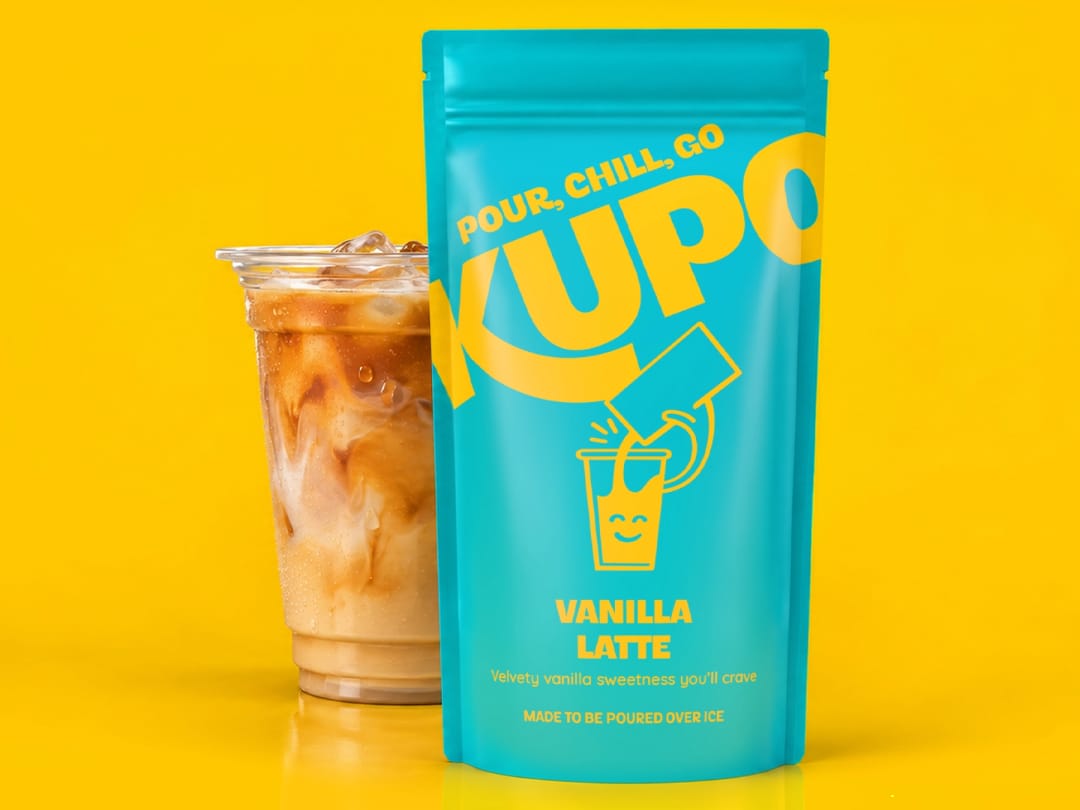
The packaging design features bold graphics and vibrant colours with the initial range consisting of Vanilla Latte, Sweet Americano, Salted Caramel Macchiato and Peach Iced Tea flavours, with multilingual packaging developed to support international markets. Slice Design says a key consideration was ensuring the design could translate effectively from individual on shelf pouches to larger merchandising displays while making the ‘pour, chill, go’ concept immediately understandable to consumers.
Alan Gilbody, founder and director of Slice Design, comments: “KUPO was a really exciting project, particularly as we had the opportunity to visit South Korea with the client and experience first-hand the pour-over-ice culture that inspired the brand. The insights we gained on the trip helped shape our approach, creating an identity that captures the energy and appeal of this distinctive way to enjoy beverages. It was important that the packaging did more than simply stand out on shelf; it needed to communicate the concept clearly, educate consumers and encourage them to get involved.”
In similar news, Carling recently rolled out its biggest brand refresh in thirty years, aiming for a ‘modern, consistent and eye-catching’ look across its lager cans and multipacks. Carling’s refreshed logo features illustrations inspired by the Carling Brewery, the British barley used to brew the beer, and Burton upon Trent, the historic brewing town where Molson Coors’ UK business is based.
The following month PG Tips revealed a refreshed packaging design and new branding created by Boundless Brand Design (Boundless) as part of a campaign for its improved Original tea blend. The updated packaging design centres around a ‘Welcome Home’ concept, focusing on elements of a British home featuring a boiling kettle and striped wallpaper.
If you liked this story, you might also enjoy:
The ultimate guide to global packaging sustainability regulation in 2026
PPWR timeline: the key dates to know

Foreign material contamination is far from an exceptional problem in food production: according to the 2026 Foreign Material Contamination in

As the Packaging and Packaging Waste Regulation unfolds, businesses must adapt accordingly. In this edition of our ‘In Conversation With…

In this edition of The Spotlight, Markem-Imaje examines how supply chains have evolved, and how Print and Apply (P&

In this edition of the Spotlight, the experts from UPM discuss what manufacturers have to bear in mind when choosing

Solidus is introducing Futurline Heat&Eat, a new trademark for its range of fibre-based modified atmosphere packaging (MAP)

Label and packaging printers are under increasing pressure to produce more jobs, in shorter runs, with tighter margins and less

In our latest Spotlight, Arnaud Brunet, Senior Director Portfolio and Sustainability at CRYOVAC®, looks at why food packaging has to

As PET bottles incorporate more recycled content, become lighter and adopt label constructions, the adhesive securing the label must perform

Dr. Bronner’s has adopted Atlantic Packaging’s Fishbone Dog Bone – a fibre-based, kerbside recyclable alternative to plastic multipack

Ahlstrom has announced its new Acti-V BIO specialty paper solution, designed for release liners in pressure-sensitive adhesive (PSA)

Aiming to utilize more reusable packaging containers (RPCs) throughout its fresh grocery supply chain in the United States, Whole Foods

Billerud is launching SteriKraft DirectSeal, a new medical paper set to balance efficient manufacturing, patient safety, and a lower carbon